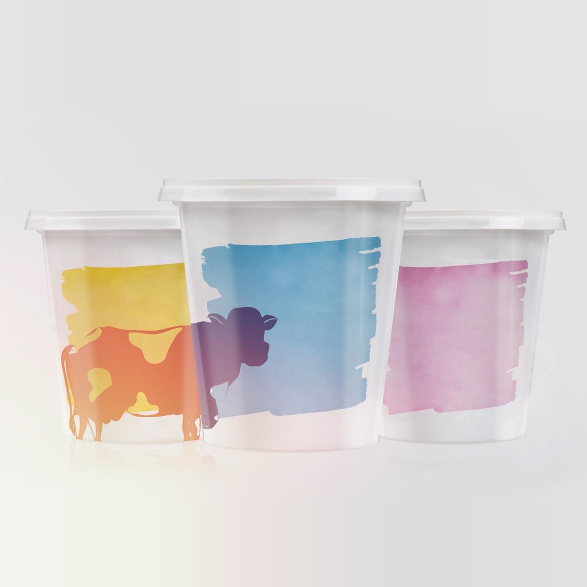
Our visual approach was plain and heads-on: a front-view shot of 3 strained yoghurt containers, each one indicating a different fat content. We animated a cow silhouette moving from the surface of one tub to another, passing through all three, before having the Zita logo fade in, with a tag communicating the products’ 20th anniversary. The script followed a similar logic, mentioning only what was necessary: the expertise and know-how that together result in great-tasting yoghurt.